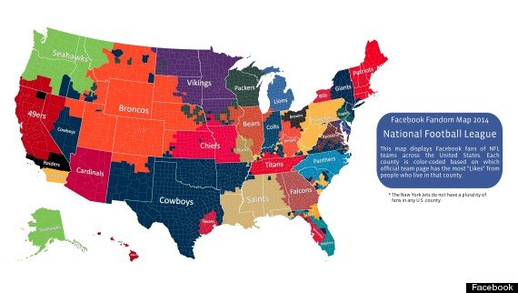
There are a few things I’m passionate about – my kids, data, and football. So, when I came across a visualization that incorporated two of those elements, I was intrigued. Facebook recently released a map that displays fans of NFL teams across the United States. Each county is color-coded based on which official team page has the most “Likes” from people who live in that county. Sure this isn’t a scientific study and there’s probably some data anomalies (people accidentally clicking like or clicking like on their rival team, etc.), but overall, from an analysis level, it’s pretty interesting.

Source: http://www.huffingtonpost.com/2014/09/07/nfl-fan-map-facebook-jets_n_5780322.html
What Stands Out:
- It’s easy to see which states have divided loyalties by observing many different colors within the state. Take a look at Kentucky, South Carolina and Florida – they each have loyalties to at least 4 teams. If we were only looking at this data from a state level, we might incorrectly assume that there is consensus among people in the state about their favorite team when that’s not the case.
- The Denver Broncos territory is pretty massive – not only all of Colorado, but also Idaho, Montana, South Dakota, Nebraska and New Mexico. You would definitely not be able to to see this as quickly if the information were in a spreadsheet.
- Take a look at Hawaii and Alaska – even though they have no NFL teams, they are all fully loyal to one team each – Seahawks and 49ers, respectively.
- Unfortunately for the New York Jets, they do not have fan majority in any county!
- Much of southern Virginia are Cowboys fans even though they are geographically much closer to other teams.
What I like about this map is that it’s just fun. To me, data discovery should have a bit of playfulness to it. Sometimes when we look at data to back up our preconceived notion, we miss the story the data is actually telling.
This is also an opportunity to be social. Pull a coworker over and take a look at this map together. I bet in less than 10 seconds one of you can make an interesting observation. Can you do that with your association data?
How this visualization could be improved for further exploration:
- Color Legend (and possibly a different color palate). When I’m looking at states like Florida, Kentucky and South Carolina, I see different colors of blue, but I can’t quite tell to what team that corresponds.
- Interactive! I want to be able to mouse over a color or state to tell how many people that color represents. For example, are there more Broncos fans then Cowboys fans? Or maybe it’s the Patriots since they have fans in heavily populated areas of the country.
How can we draw parallels between this and your association data?
- It’s interesting that loyalties are not nicely divided between state lines. I imagine that this is the case for the opinions of your customers and members as well. How might that impact your marketing and event location choices?
- Why are entire states loyal to a team even when the team isn’t based there? Is it because they are culturally similar? Maybe it’s because that’s what the local radio and TV stations air. When looking at something like purchases by segments within your association, it may be interesting to consider if they are buying what they know about due to your targeted marketing or if what they are buying is truly the best fit for their needs.
Data analysis should be as easy as the image above and even more interactive for your association. What areas would you like to explore? What will get your staff talking about data instead of just spitting out numbers at staff meetings? Spending a little time with a fun topic like sports or weather could spur the creativity to look at your association’s data in new ways.


