It used to be that when I talked enthusiastically about the field of statistics people’s eyes would glaze over and I realized I really must be a bit of a geek, but these days all associations want to understand their customers (members, non-members and prospects) and the way they interact with us. We want to learn who they are, what they do, where they work, how they engage, why they renew, and many other things. We can answer these questions using both descriptive and predictive statistics. When we combine statistics with data visualization and discovery tools like Tableau, it’s much easier to understand the story our data is telling and then use that information to create the future we envision.
The field of statistics is no longer the esoteric domain of PhD’s and statisticians. For example, this membership visualization “describes” our members and answers business questions about how well we retain different groups in different states (this is called descriptive statistics):
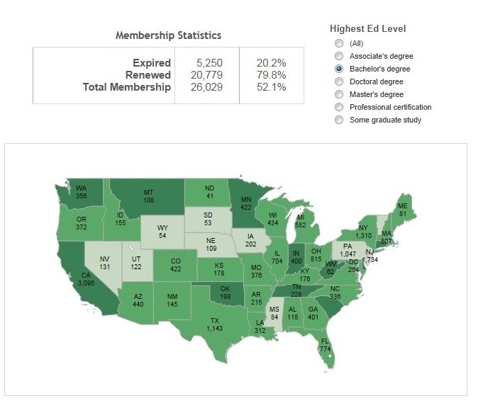
- In this example we are using a demographic of “highest level of education” but we often build these models with more than one demographic, such as age, gender or specialty.
- By selecting Bachelor’s degree we filter the results and can quickly see which states have the best retention – as indicated by the dark green. For example, California is clearly doing a great job.
- What’s great about Tableau is that by right clicking on any of these states, we can actually see the details of each record, including name and contact information.
But What is the Reason Why?
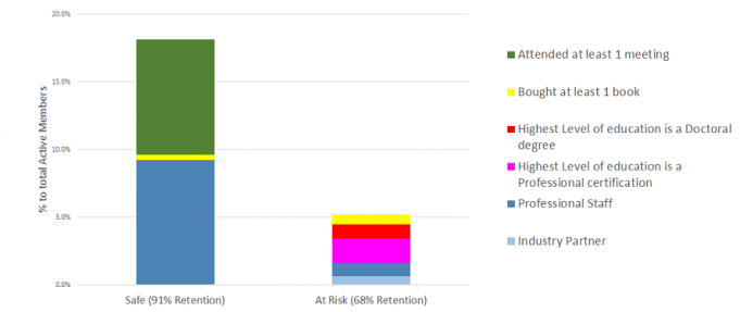
The next logical question we have is, “Why are the dark green states doing better with retention? What are they doing differently?” To answer these questions, we use predictive statistics to determine the key factors that most influence member retention.
In our example we use linear regression analysis. We analyze the variables of meeting attendance, book purchases, membership category and level of education to determine their effect on retention. We create a formula which outputs the coefficient of each variable. The coefficient is that variable’s contribution to the predicted outcome of retention. The initial hypothesis is that no variable is correlated and we test each variable independently to see if it performs better than average. In other words, a correlated outcome is that as meeting attendance goes up retention goes up – we test to see if this is true and if it is, then the variable is statistically significant. This is an equation that is run for each record.
In our example, we found that meeting attendance, book purchases and the membership category of professional staff were positively correlated, which means they increase retention. This may seem intuitive, but what is not intuitive is the factors that are negatively correlated – in our case, membership category of Industry Partner and a highest education level value of either Doctoral or Professional certification.
- Next, we “score” our current members and rank order the scores. The score is very much like the FICO credit score that predicts a person’s probability of paying back debt.
- Members are grouped by these scores and then we can identify those who are most at risk

- Now we can drill down, identify those who are “at-risk” and create marketing programs specifically targeted to increase their renewal (like ensuring they attend at least one event – even if we have to offer them a special discount!)
- We also want now to identify more attributes about those individuals who are renewing – what else do they have in common and what else should we be tracking?
Now imagine interactive dashboards for your association that include all forms of engagement: web activities, donations, advocacy, volunteering, social media postings and more. We increase our understanding of individual and aggregate behavior when we use statistics and visual tools like Tableau. We see and learn what is important to those we serve in our community of interest. Imagine the power of understanding the story your data is telling and using that information to advance your mission! Using statistics and Tableau, it is now possible to explore our data and understand our members and their behavior so that we can increase their engagement, increase our relevance and better serve them.