Let’s say the day has arrived when your association is on the path to data discovery and visualization. Your technical and business groups have aligned and all data sources haven been identified – great! The data quality management system has been put into place, and you have complete, clean data ready to be processed into effective visualizations for analysis. Now, you’re ready to bring the data into your visualization application and start to create and explore. There are a few things to consider when connecting your data to a visualization application that will greatly improve your chances of successfully turning your concepts into effective and accurate graphics. Below are three things to keep in mind to ensure all users have a consistent understanding of the data and are able to make the best use of the visualization tool.
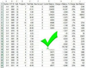
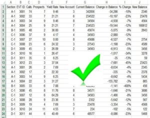
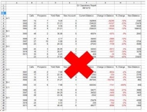
Remember that primary data is preferred when building visualizations. Raw, unprocessed data is at the heart of creating effective and meaningful visualizations. Although we all like to see our information summarized, pivoted, and nicely labeled, visualization tools typically like their data un-summarized and unformatted. Make sure your data is in rows and columns of clear information.
Clearly name all of your data sets. When bringing your data into a visualization tool, there are times when using the column names as they appear in your database may be tempting. If it was clear enough to be used in the database table, why not as the label for the same data when it’s brought into the visualization tool? There are several very good reasons why this is not always the best idea. Although these fields and naming conventions are extremely helpful for developers working directly with databases (e.g., DIM_ Reseller_Sales_Order_Details_ID – what??), it is important to keep in mind these are based on specific technical jargon with which the business user working with the data to make visualizations is not necessarily familiar. The audience using the data to create visualizations will likely not be the same technical staff working with your databases. Therefore, it is best to label data sets clearly to avoid ambiguity. Rename your data sets with clear, descriptive titles to ensure quick and consistent understanding of the contents of the data set among users.
Set default aggregations for all measures. Data brought into a visualization tool as a numerical value will be brought in with a default aggregation (e.g., a sum, an average, a median, etc.). Always check to see what this default aggregation is set to for the data you are using in your visualization. There may be times when you will want to manually change this default to ensure the visualization is accurately rendering the information you are intending to highlight. For example, showing a bar chart of the average sales per month of a particular item is vastly different than showing a bar chart of the sum of all sales per month. Another example is customer or registrant identification numbers. These numbers should be brought in as unique values, and not as numerical data that can be aggregated through summation or as an average. Without carefully checking the default settings for your data, you could potentially mislabel your visualization and render inaccurate information.
One of the main strengths of current visualization applications such as Tableau is enabling the non-technical business user to analyze data without a great deal of training, or reliance on technical staff. This is not only important to the individual user to better perform his or her job, but it is also of great strategic value to your organization. So empower your users! Always keep the process as easy as possible so their energy is invested in posing great questions to your organization’s data, not deciphering the data sets or maneuvering through the application. Remember that the ability to investigate the stories in the data become diluted if the data sets are unclear and confusing. Avoid cryptic titles and mixed aggregations. It is essential we begin with precise, clear data as the building block of our visualizations.


