Today we have a rich array of applications available to us that can turn data into meaningful graphical representations fairly easily. With these innovations, a new era of dashboards has emerged. No longer are the Excel bar graphs or pie charts solely what we have to settle for, although they have their place and were a long-time favorite of mine. Those of us who love working with data know how visualizations help us understand information faster and more effectively than reading charts of numbers or sifting through spreadsheets. This quick, efficient means of communicating is just something we innately respond to. Do you ever wonder why that is? Why don’t we just as easily get the meaning from the stacks of data? It is because of how we as humans perceive stimulus and how our brains work. Making the best use of visualizations includes designing them in ways that are most effective for our eyes to perceive and our brain to then interpret. We want to render images that our mind can easily process to make sense of complex information. Your mind is the best computer there is, but it has its own specific preferences.
Thinking is slow. Seeing is FAST. Human sight is handled by the visual cortex located in the back of the brain, and is extremely fast and efficient. We see immediately, effortlessly. Thinking, however, is handled mainly in the cerebral cortex in the front of the brain, and is much slower. Data visualization takes advantage of the efficiency of our visual perception.
Studies have found that the human brain interprets graphics simultaneously, while text is decoded in a linear, sequential manner, which takes more time to process. Therefore looking at data represented graphically is an advantage because it takes less time for the brain to understand it.
The human brain prefers something called cognitive fluency. Essentially this means our brain prefers things that are easy to understand. This is because it has to spend less time processing simple design, and our mind then has to spend less time making sense of it. We instinctively ‘get it.’ To optimize a dashboard for visual information processing, keep it simple and communicate as much as you can in as few elements as possible.
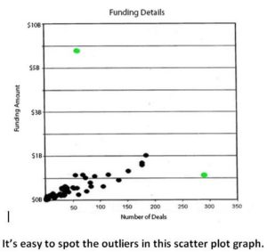
Graphical representations of data enable us to quickly see patterns and anomalies. Using elements such as color, you can use visual cues to easily communicate information.
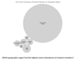
By relying on the mind’s understanding of basic constructs, we can convey concepts that would take much longer through numerical data. Spatially, we instinctively know that big is more and small is fewer.
Context is key. It is important to keep it simple without losing context. Some context is necessary, but remember your audience does not need to be overwhelmed by it. We want to give the audience enough supporting information for the data to be actionable, but not so much that the meaning and focus becomes muddied and unclear. The interactivity component of many of today’s dashboards allows us to receive a great deal of context because we can access the underlying data. This enables us to ask complementary questions of the data which in turn provides more certainty in making decisions based on the story the data is presenting. An example of this is when a dashboard design includes a pop-up window with supporting information for each key data point on a bar chart.
Consider using color sparingly. A case can be made for using a muted color pallete when creating a dashboard. Your retina converts visual information into electrical impulses that are then routed through specialized neurons to the brain to communicate color information. The more color variations on the screen, the more effort has to be exerted by these neurons to send information to the brain, and less focus is on extracting the meaning of the actual information.
The ability to take data and process it, extract value from it, visualize it, and communicate its meaning is one of the most rewarding pursuits there is. IBM’s claim that every day, we create 2.5 quintillion bytes of data and that 90% of the data in the world today has been created in the last two years alone, is pretty amazing. But also equally amazing: You potentially already have the information at your fingertips to be able to provide personalized service to each of your members and prospects on a level that would more than satisfy their desire to engage with your association. You can harness the information that will enable your association to create broad-based outreach strategies world-wide. And the information is available for you to create events focused on the needs of those who look to your association for support, leadership, and education. Very soon we will look back and wonder what we were doing before we took advantage of all of these opportunities that data provides.


