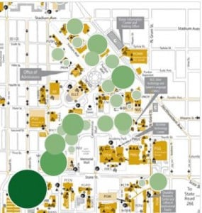
Many nonprofits are challenged by attracting and retaining members and engaging stakeholders and other customers. Tableau published a great white paper entitled, “8 Ways Universities Are Making an Impact with Data,” which is available as a free download. Your association may have more in common with a university than you might realize and can learn from these three ideas.
Create an interactive Factbook
Universities such as Cornell are putting their Factbook online where prospective students can find, interact with, and filter information such as class profiles, admissions data, degrees awarded, faculty and more. They discovered there are two different ways the data is used: some incoming students want to be with people like themselves and others prefer to be with people who are not similar to themselves. Although this seems like an obvious generalization and one that would certainly apply to incoming freshman, why wouldn’t it apply to prospective members of your association? Imagine how helpful it is for a prospective member to go to your web site and slice and dice an interactive visualization to see for themselves if they’ll find people to connect with – regardless of whether they are seeking individuals similar to or different than themselves.
Communicate survey results
A common problem with survey results is that the data can be extensive and hard to use. Data visualizations to the rescue! Undoubtedly your association is doing surveys in the industry. How do the results get communicated and to whom? Is it a PDF with a series of tables or an interactive chart? Consider using a visualization tool such as Tableau Software, and making the results available to everyone.
Show fiscal responsibility
This is important for universities, such as the Utah Valley University. They provide charts showing their financial management in an era where appropriations from the state are highly variable. An extreme example from the association world is the ALS Foundation which recently received over $100 million in a matter of weeks as a result of the Ice Bucket Challenge. Many eyes are now focused on them, watching to see how the money will be managed and spent. What if your association started using data visualizations to show your board how income and expenses align for your annual event or if you shared financial data with members to assure them that the finances are well managed and meeting mission goals? Would using visualizations reveal money saving opportunities?
Check out the other five ideas for how universities are using data and see if your association can benefit from them as well. All associations are looking to increase engagement. There are many examples of nonprofit organizations like universities using data to tell their story, save money, and better serve their constituents.


