In Tableau 9.0, we see the introduction of Level of Detail Expressions. With fairly simple expressions, we can calculate and display powerful information. The Level of Detail (LOD) Expressions allow us to compute aggregations that are not at the same level of detail as the visualization. I know that sounds a little abstract – but you can use these values in very interesting ways. I’ll give you some real world examples below. .
Here are a few questions that were previously difficult to answer that are now much more straight forward.
- How many of our customers have attended one, two, three or more events?
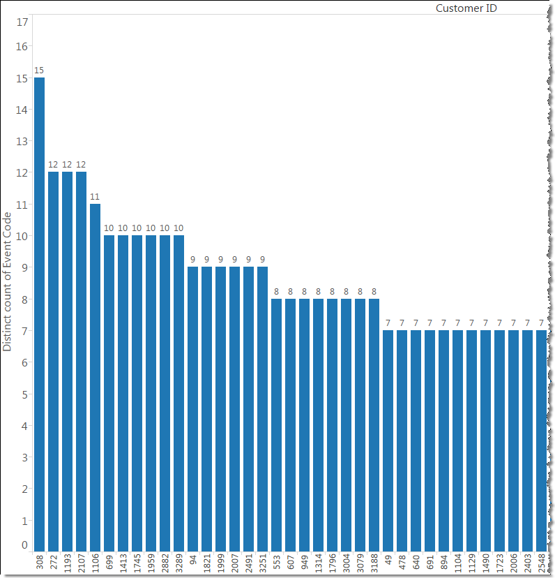
Previously we might have ended up with something like the graph shown below. We can see that 1 customer has attended 15 events and 3 customers have attended 12 events, but as we decrease in the number of events and the number of customers increases, it becomes more difficult to easily see the number of customers who attended 8 or less events.
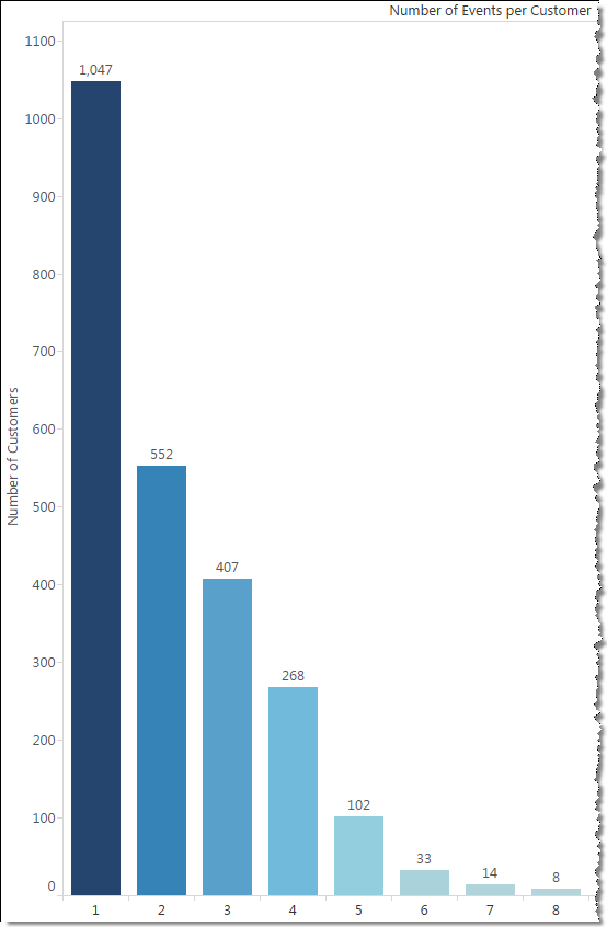
Now, a simple LOD expression can turn a count of events by customer into a dimension that breaks out the number of customers. Look how much cleaner this graph is!
For those familiar with Tableau expressions, here’s the formula I used to calculate the Number of Events per Customer. Since the calculation is done within Tableau and not in the data mart, this will change based on the filters applied. For example, we could filter on the fly by event type, event location, etc. and the Number of Events per Customer will update accordingly.
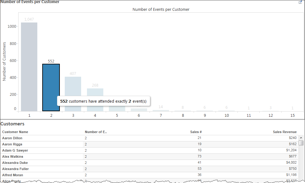
Not only does it look better, we can do a lot more intuitive, interactive filtering with this graph. For example, we can easily add a chart that shows details of the customers that attended exactly 2 events. The possible details you can display are limited only by the data you have in your data set. In this example, I’ve pulled in the customer name, the number of orders (not just event purchases) and the total revenue from all purchases.
Of course, if you are a curious person, you might want to know even more information. You might ask a question like this one:
- Can we take a look at the location of the registrants compared to event revenue and how many events they attended?
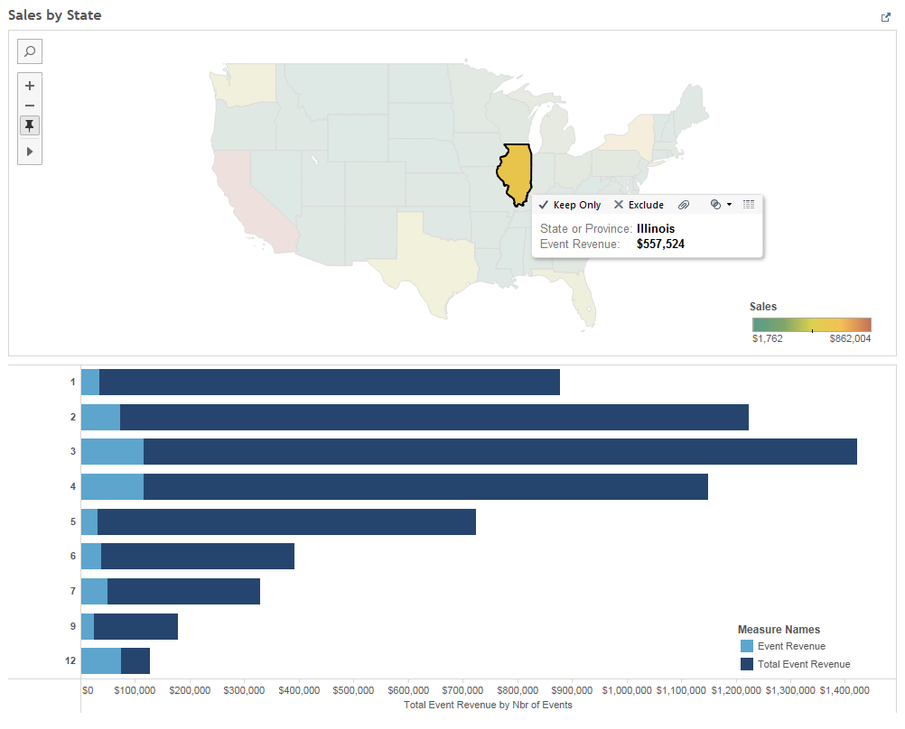
Using another LOD Expression and the use of a map as a filter, we can put together a set of visualizations like the one below.
In this set of visualizations, we can see that for the customers in Illinois attending exactly 12 events, their event revenue is over half of the total event revenue while those attending exactly 1 event represents a much lower percentage of total revenue.
The beauty here is that even though I’m showing the total of events attended, I haven’t lost the level of detail that allows me to get down the customer’s address level.
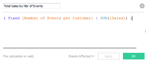
This is the LOD Expression that allowed me to see the sales per the number of events attended.
I hope that your mind is now thinking about all the possibilities and ways you can visualize your data.
