I recently had the opportunity to attend a workshop called Storytelling with Data by Cole Nussbaumer Knaflic. Instead of focusing on data analytics tools, the workshop focused on using data as part of the storytelling process. We reviewed the fundamentals of data visualization and how to communicate effectively with data.
Here are five steps you can take to tell a story with your data.
Step 1. Give Your Data Context
After you have created your exploratory analysis (identifying interesting things to learn from your data), you can move to explanatory analysis (communicating these findings to someone else).
Just like in other forms of communicating, you need to think about your audience and the message you want to convey. You will need to understand the current situation.
Low tech storyboarding can be used to plan out your communication plan. The risk and impact are lower at the beginning if you need to modify your plan to ensure that it is clear.
Step 2. Choose the Right Visual Display
Choosing the most effective chart type for your data is important. There are no hard and fast rules but there are definitely guidelines.
We’ve discussed choosing the correct chart type before, so this part of the workshop served as a reminder to be deliberate in choosing the correct chart type for your data. Here’re some blogs we’ve written on this topic before: Powerful Visualization Choices (Part 1), Part 2, Part 3, Part 4.
Step 3. Declutter Your Viz
This is a step that it may be easy to skip, but it is one that will take your chart from drab to fab!
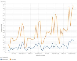
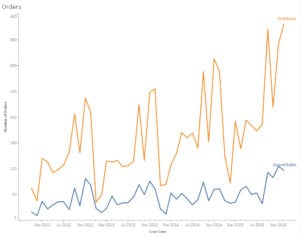
Take a hard look at the visual you created. You want to ensure that each element on the chart has a value. Think about chart borders, gridlines, data markers, axis labels and legends. Each element on your chart adds to the cognitive load for your audience. We want to make it as easy as possible for them to concentrate on the data story you are trying to tell, not spending energy trying to decipher all the visual cues you are throwing at them.
Here, Cole explained that we should consider the Gestalt Principles of Visual Perception which explains how people interact with and create order of out visual stimuli.
It was very interesting to see how the principles aligned with my experiences. Cole’s book explains this better than anything I could find elsewhere, so I guess this is my plug to buy the book!
Step 4. Focus Attention on the Key Parts of the Story
All good stories have the main characters and a central plot.
Once you have chosen the correct chart type and reduced clutter, keep thinking of the audience and the story you are trying to tell.
Here we learned about preattentive attributes (size, color, and position) and how to use them to focus attention. Our brain is super quick at picking up on preattentive attributes and we want to use that to our advantage.
These attributes should be used sparingly and purposefully. For example, don’t use color just to make it colorful. Use color to direct attention to what you want the audience to focus on, such as lower than acceptable KPIs or better than expected renewals in a member segment.
One simple exercise you can do is to ask a coworker or friend to look at your chart ask them where their eyes go first and where it is drawn. This can help you confirm that the chart you’ve designed is drawing attention in the way you expected.
Step 5. Tell Your Story
Once you have your beautiful charts, you need to think about how you will convey this information to your audience. The advantage of a story is that it sticks in our memory and can be retold. This is important as we seek to persuade others to see our point of view. You also want to use texts, labels, and action titles within your presentation. Just like your favorite movie or children’s book, think about how conflict and tension can be used when telling your story with data.
One technique I really liked was building the visual as you talked. For example, during an in-person presentation, have a slide that only shows the title and axis, then builds in the legend or categories. This allows you to explain your chart without having people focusing on the data yet (tension and suspense!) and then hit them with the data. You can even build the data in by showing past history first (context) and then showing current information.


