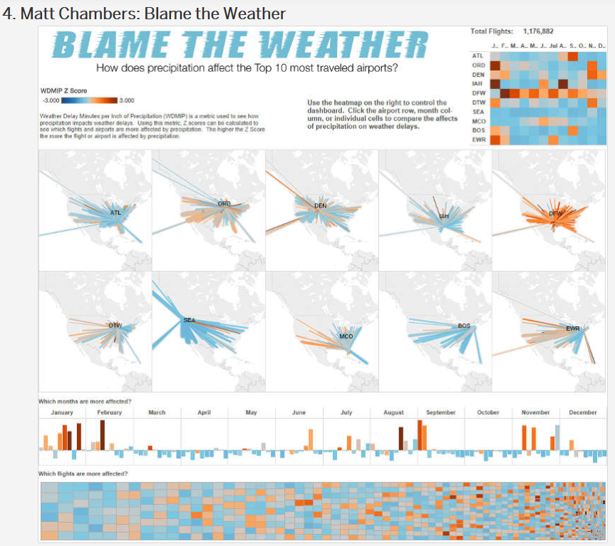
When I review a new visualization, I’m always thinking it doesn’t have any wow factor. Here is a perfect example of something that gives an initial impression of WOW, but upon further review takes a lot of effort to understand.
 This was voted the fourth best Tableau Public “Viz of the Day” for 2015. When I’m building a visualization, I always look for pizzazz and pop right out of the gate. This one fits that bill. Visualizations need to be effective and not just eye candy, especially if you want to increase adoption and usage.
The first step to get there is to change your mindset. A few excellent suggestions from data enthusiast Joshua Burkhow will also help you see progress, with increased adoption and data driven decisions at your association. Here’s how to make it happen:
- Understand the end goal. This is specific to planning a deliverable as opposed to simply exploring data. Target the viewers and interactors of the dashboard. Talk to them and determine what they want to get out of it before you sit down to assemble the viz.
- Be iterative. Don’t expect perfection the first time through. Share it often and incorporate the feedback received.
- Drop the tables. For the most part, leave the datasheet tables off the viz. Yes, there is a time and place for them, but graphical representations are more effective for the brain.
- Enjoy some white space. Don’t overcrowd and put everything on one page. It will turn into the dashboard version of the garage who has no cars inside, but rows and rows of boxes instead. Just try to find something in there!
- Entertain with a story. This is a true story based on your data. Storytelling is really a separate topic on its own. Its point is to provide context and make it memorable.
- Mix it up a little. Repurposing and reusing is wonderful, but it isn’t always the best approach. Explore new visualizations. Maybe changing the look is a more effective way to see what the data is saying.
- BONUS: Aim for the masses. Each association professional will have a different opinion, so it might not be possible to incorporate everyone’s desires – certainly not on one visualization. Think of it like ice cream flavors. How many are there? Lots! Focus on the differences between vanilla and chocolate to please as many people as you can.
Here is an event demographic visualization I like it because it combines registration count, individual demographics, organization demographics, and a map. It isn’t too busy and provides a quick breakdown of meeting attendees.