
Meet Jordan.
They run marketing and events at a national professional association. In seven weeks they asked Atlas more than 400 questions and turned the answers into six dashboards shared with their whole team.
- Organization
- National professional association with individual and organizational memberships, a year-round education calendar, a flagship annual course and an annual conference
- Systems
- An AMS for members, orders and registrations; an email platform for campaigns
- Owns
- Filling seats, email performance, member outreach
- Before Atlas
- Member, registration and email data lived in two separate systems
Starts with one chart and ends the day with thirty.
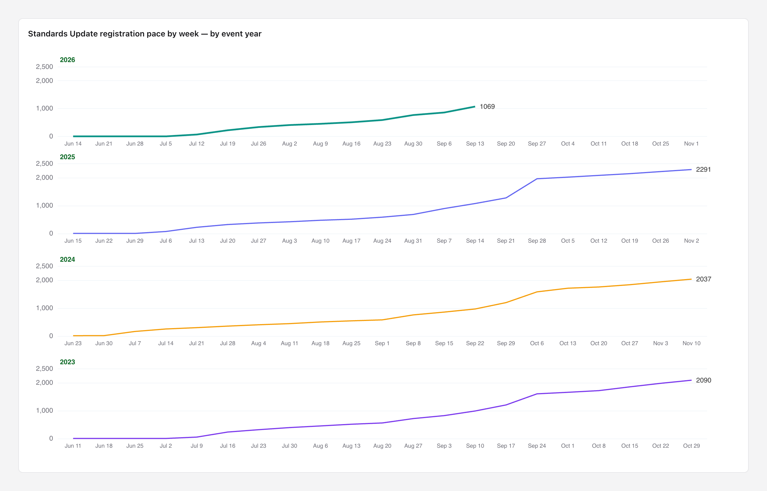
Jordan's first question was a bar chart of upcoming course registrations. By the end of the first day they had rebuilt it, put it in date order, mapped where registrants were coming from, and focused on the association's biggest product, the Annual Standards Update.
Tests Atlas against their own system.
Jordan came back holding a report from their AMS that didn't match Atlas's revenue figure. Atlas walked through the gap line by line, and the explanation told Jordan something new about their own business.
The whole gap. Team viewing packages (a single purchase covering a group of staff) were in Atlas's line but not in the AMS report, and the two pulls were taken on different days.
Registrations per session rose every year for five years. The headline total fell only because the association ran fewer sessions. It was a supply decision, not falling demand.
Cancellations outweigh test and staff accounts 40 to 1. Jordan still had test and staff records removed from every chart.
This is the moment Jordan started relying on Atlas. Eight times, a number didn't match what they expected, so they brought the AMS or email-platform figure and asked why. Each time, Atlas showed which business rule produced its number: which events count, whether team packages are included, how staff and test records are treated. Then Jordan decided how their association wants it counted. Those rules belong to the association, and its feedback updates them, so the next answer and every dashboard built on it follow the association's own definitions.
Builds a membership prospect list from scratch.
The question: which members pay their own dues while working for an organization that has no membership? Those organizations are the best leads for an organizational membership.
Non-member organizations that already have 650+ paying members on staff, exported as a cleaned contact list with the members at each one.
The real opportunity turned out to be organizations whose membership had lapsed. Very few of the organizations that had never joined fit the target profile.
Jordan learned that many employer names were typed in by hand rather than linked to an organization record, and how to tell the two apart.
Finds out whether email actually fills seats.
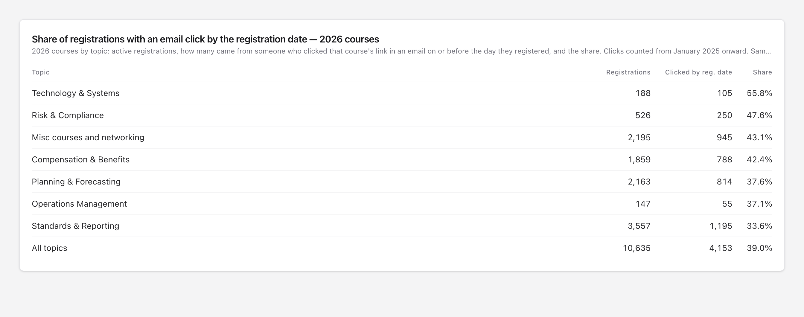
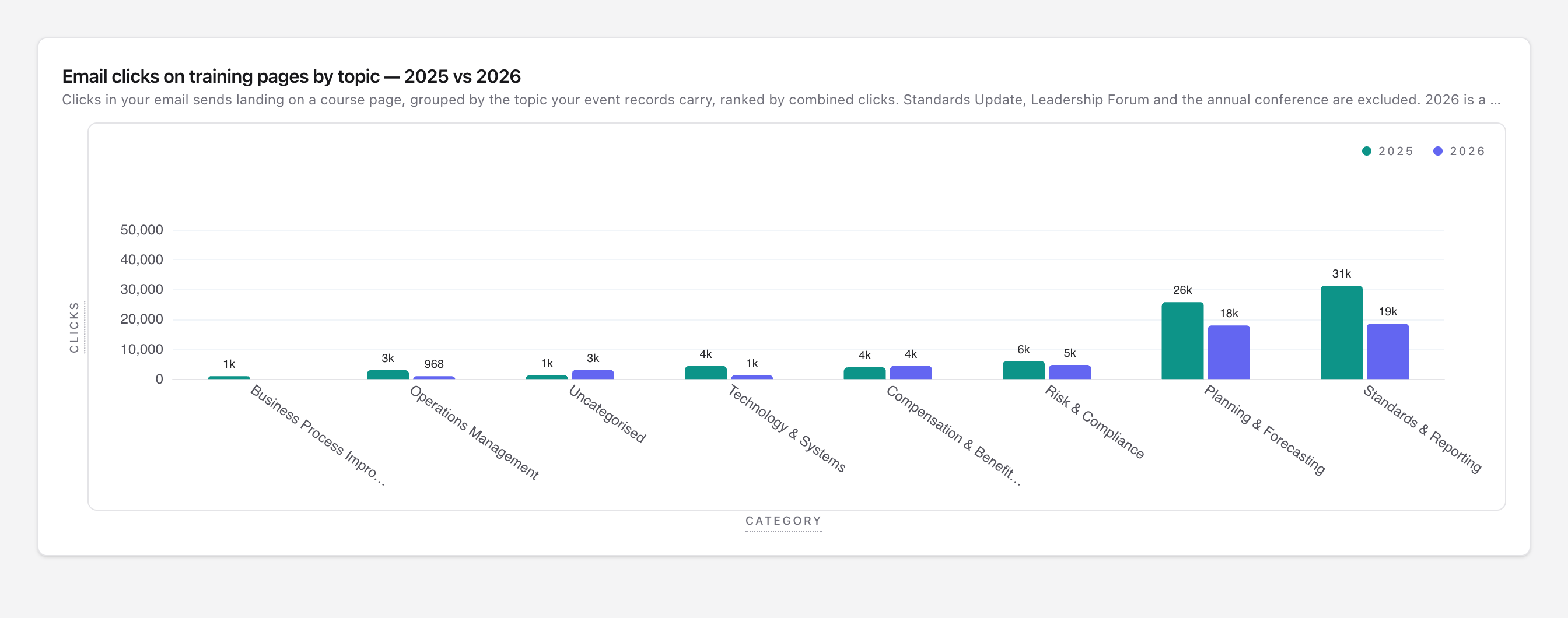
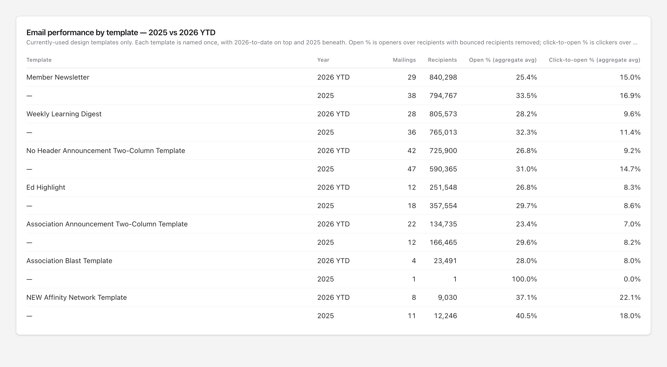
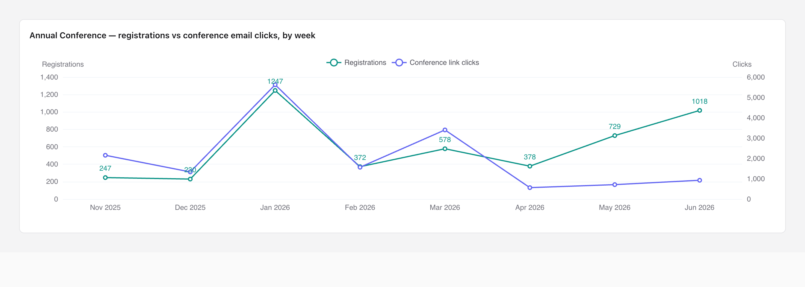
When Jordan found out Atlas could match email clicks to registrations, the questions changed from "what happened?" to "what caused it?"
Share of course registrations where the person had clicked that course's link in an email on or before the day they registered.
Of people who clicked a course link, the share who went on to register for that course. For the flagship course it was nearly double.
Open rate for subject lines under 30 characters, compared with the average. Urgency words ("last chance") had the worst click rate.
Turns the analysis into a to-do list.
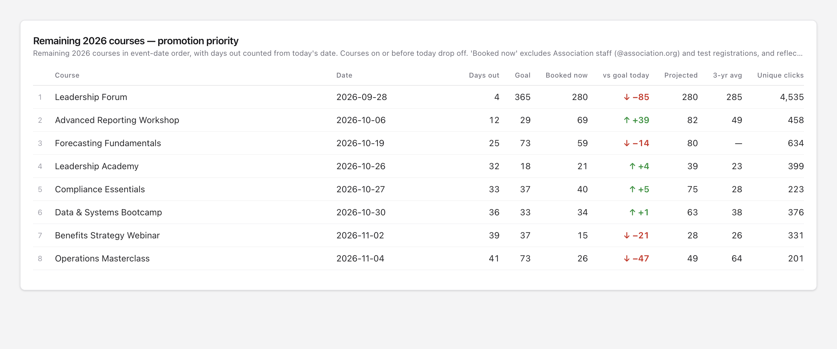
Jordan pasted in the events team's registration goals and asked which courses needed promotion most. The result is a live table pinned to their email dashboard.
Builds dashboards for the whole team.
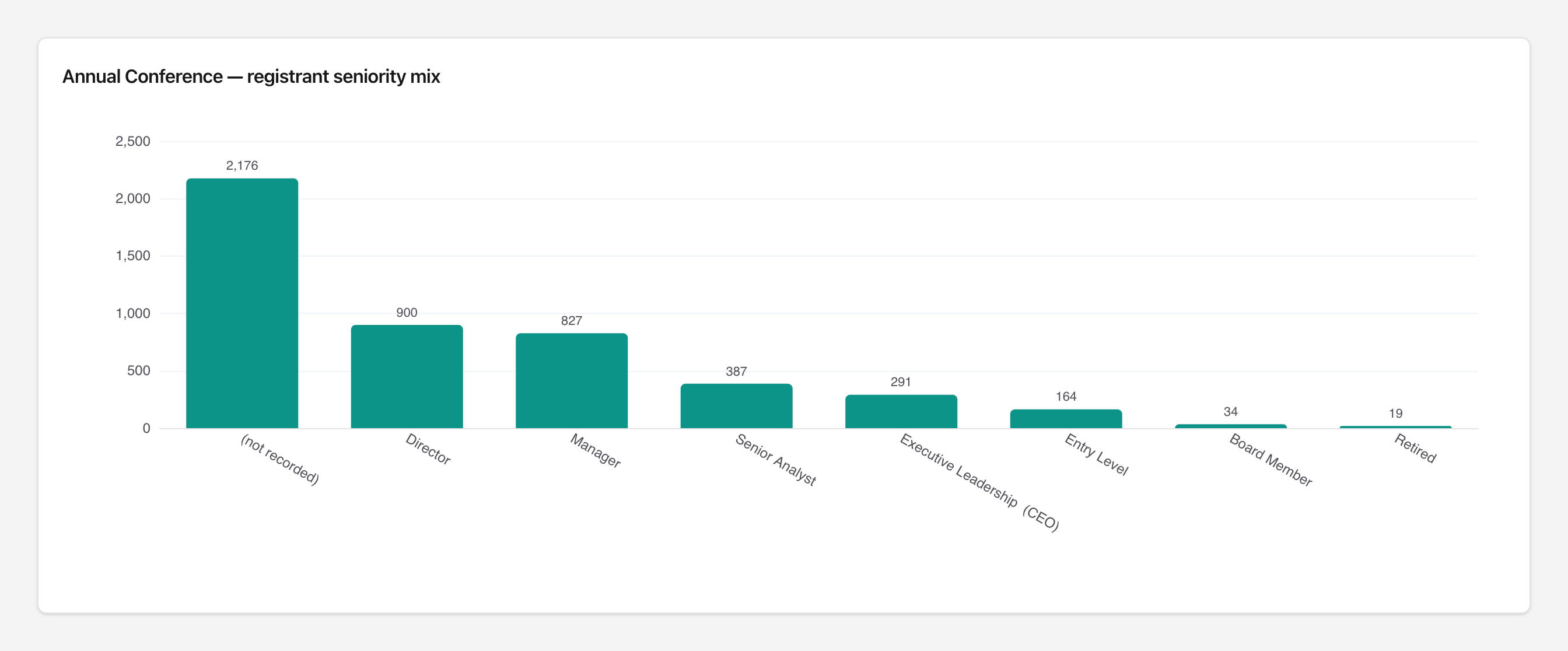
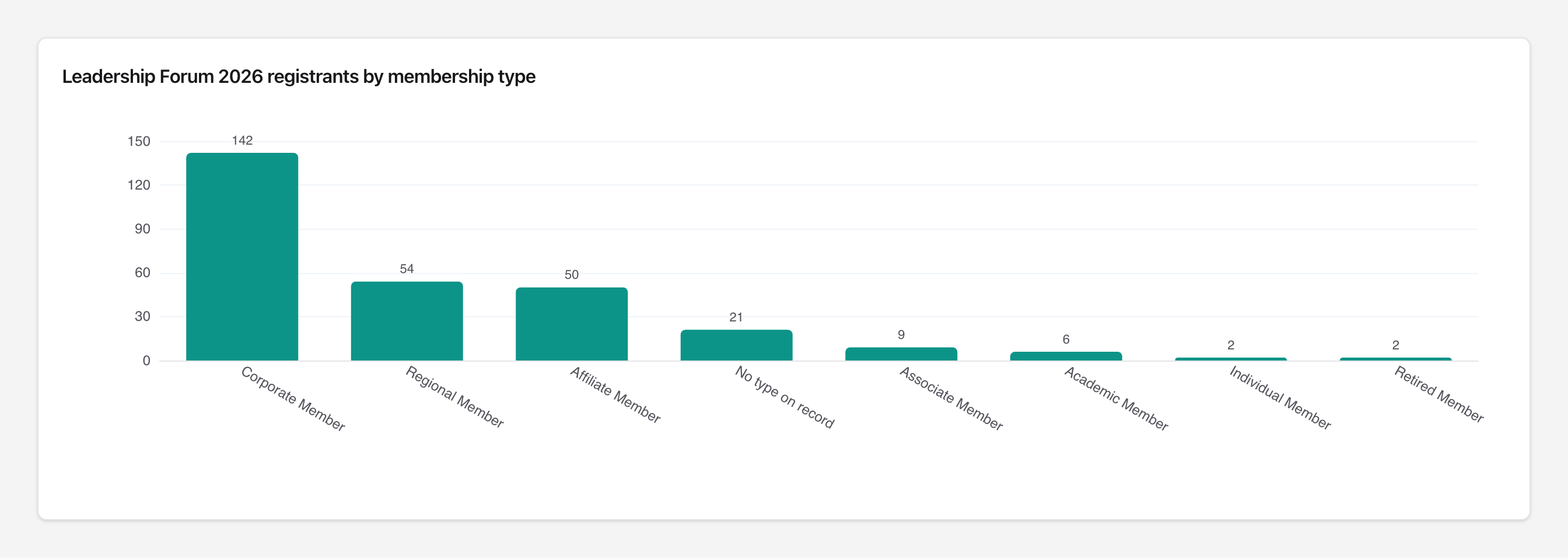
In the final week Jordan moved their charts into shared dashboards: one each for the flagship course, its encore, email, the Leadership Forum, the conference and marketing. They also asked Atlas which charts didn't serve each dashboard's purpose.
Share of current members who have never registered for the annual conference. Jordan made it a KPI card.
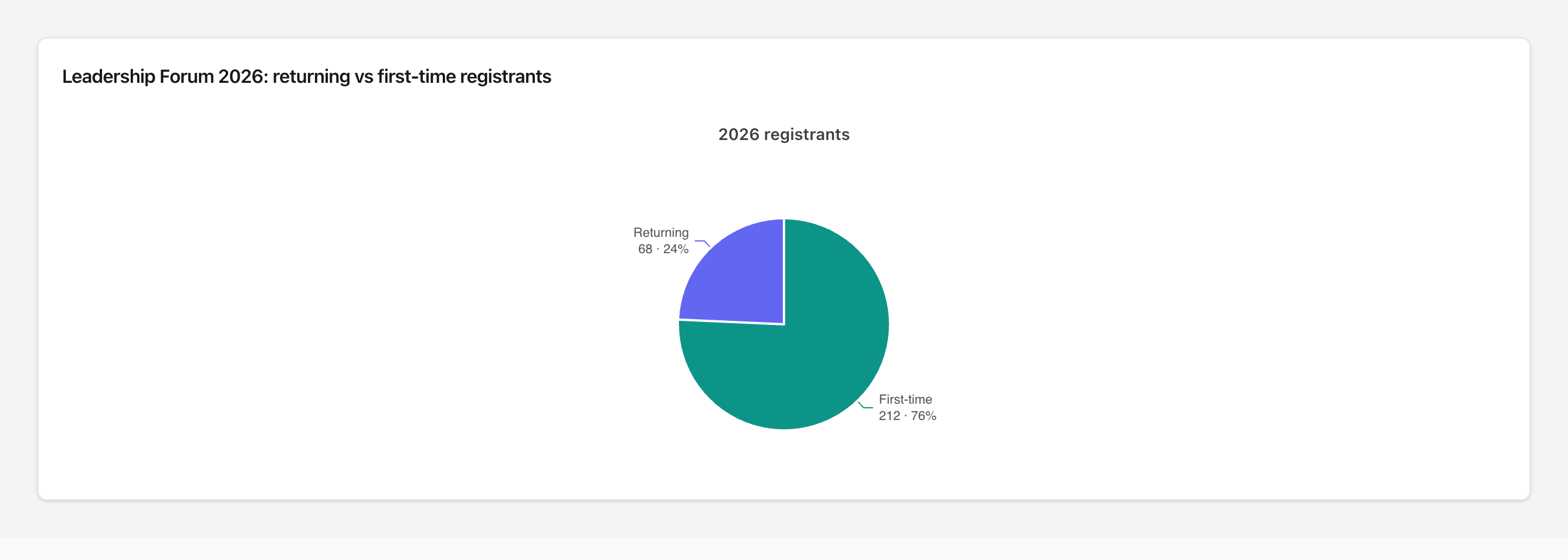
Share of this year's Forum registrants attending for the first time. The event brings in a new audience every year but keeps few of them.
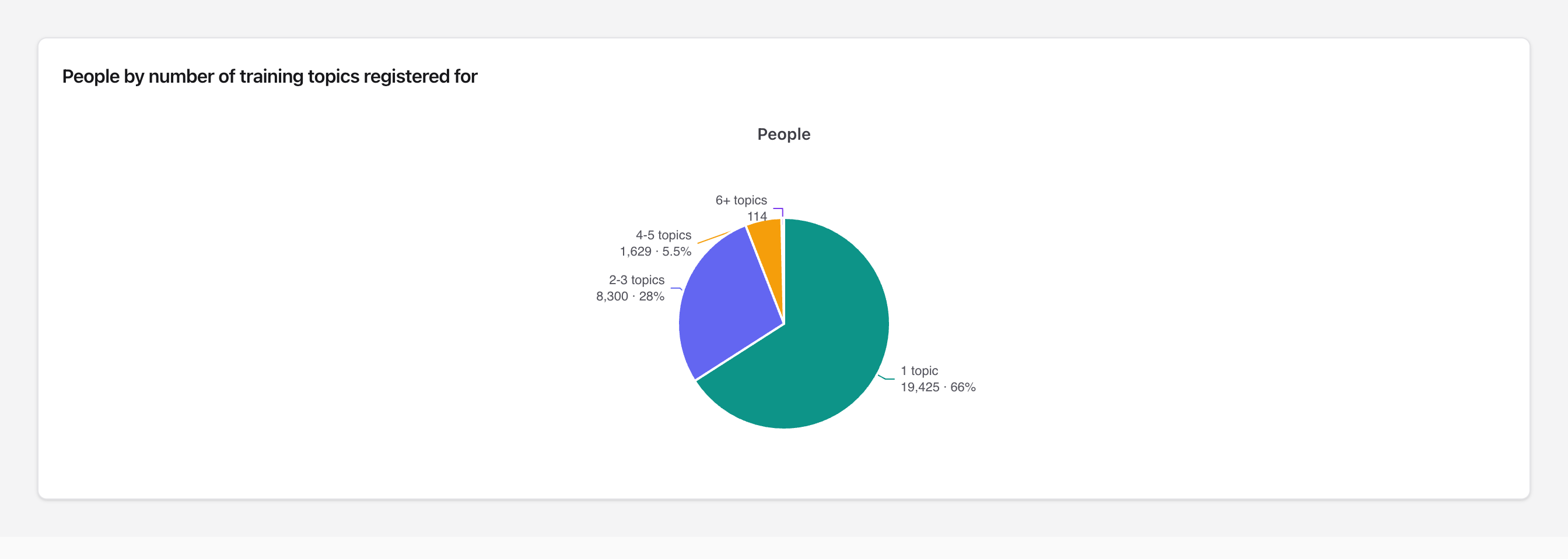
Share of learners who have only ever taken courses in one topic. The 28% who take two or three are the natural audience for cross-promotion.
Seven weeks of questions, priced
Every opportunity Jordan found is priced with their association's own average registration fees and dues, taken from their Atlas data, under an explicit conversion scenario. Every row is potential value if they act on it. None of it has happened yet.
Conservative to moderate scenario, across seven opportunities.
About 60 analyses joining AMS and email data. Almost every question ran a live query, more than 1,000 in all.
One more session of the flagship course. Registrations per session have risen every year, so the demand is there.
| Opportunity | Basis | Conservative | Moderate |
|---|---|---|---|
| Promote courses projected under goal | About 180 seats short of goal; close 25% / 50% of the gap | $16K | $31K |
| Conference first-timers | 69.5% of members (about 19,000 people) have never registered; 0.5% / 1% register | $49K | $98K |
| Cross-promote to single-topic learners | About 19,400 people have only taken one topic; 0.5% / 1% take one more course | $31K | $62K |
| Win back lapsed organizations | About 4,300 lapsed; 1% / 2% reinstate | $25K | $49K |
| Renew organizations in grace period | About 400 in grace; 5% / 10% extra renewals | $12K | $23K |
| Point flagship emails at the registration page | Registration-page clicks convert at 30% vs 16% for the overview page, which gets 73% of clickers; move 25% / 50% of that traffic | $14K | $28K |
| Bring Forum attendees back | Raise the 24% returning share by 5 / 10 points | $5K | $10K |
| Total | ≈ $150K | ≈ $300K |
- Not every finding is about revenue. The organizational-membership prospect list mostly swaps individual dues for organizational dues. Its value is the relationship, so it's left out of the total.
- Email figures show association, not proven cause. Some of those registrants would have come anyway, so treat the email row as a ceiling.
- The rows overlap, so the total isn't strictly additive.
- How to prove it in 60–90 days: did the flagged courses close their gap, did lapsed and grace-period organizations renew, and did email conversion move?
What a non-analyst actually does with Atlas
Answers in minutes, not export cycles
Without Atlas, every question on this page would mean exporting from two systems and building a spreadsheet. Jordan asked in plain English and iterated on the answer in the same conversation.
Joins the systems they already have
The most valuable findings, such as email's share of registrations, promotion gaps and member prospects, only exist once AMS and email data are matched person by person.
The association sets the rules
Every number comes from the association's own business rules: what counts as a registration, a member, or a click. When Jordan checked a figure against their own systems, Atlas showed the rule behind it, and Jordan's feedback shaped how the rule applies from then on.
Moves from their questions to their team's dashboards
Within seven weeks, one person's exploration became six live dashboards shared with the rest of the organization, all built through chat.
About this persona. Jordan is based on one real Atlas user's first seven weeks, reconstructed from their chat history. To protect the customer, the person's name, the organization, its events, course names, topic names, member types and system names have all been changed, and every count and dollar figure has been altered. Percentages and the shapes of the charts are real. The screenshots are from the user's actual dashboards, with the same changes applied. Values in the “What it's worth” section use the same altered counts and dollars.